日本語
日本語  English
  简体中文
简体中文  Deutsch
  Español
  Français
  Italiano
  한국어
한국어  Polski
  Português
  Русский
  Türkçe
  Nederlands
  Tiếng Việt
  ไทย
ไทย 
Yes, a custom logo sign can show brand colors and gradients. It works when the face method suits the design. A solid color, a printed fade and a color-changing light are three different builds. Each one needs its own face material, color method and LED.
That’s how many color complaints start. The buyer approves a logo on a bright screen. The factory builds what the file shows. Then the sign switches on, and the purple turns gray.
This guide helps you avoid that. You’ll learn which method fits your design. You’ll see why a lit face looks different. And you’ll know how to approve color before production. SignliteLED makes LED 照らされた文字 and logo signs for sign companies and brands. Our engineers show the face build on the shop drawing before anything is cut.
迅速な答え
| What you need | Usual starting point | What you do |
| Solid brand color | Colored acrylic or translucent cut vinyl | Send a Pantone or brand color code for each area |
| Fixed gradient, such as blue to purple | Printed face: printed translucent film or UV print on acrylic | Mark the start color, end color and fade direction |
| White lettering | Lit white, opaque white or an unlit area | Tell the factory which white you mean |
| Color-changing light | RGB or RGBW LEDs behind a white or opal face | Say static color, slow fade or programmed effect |
| Final approval | Lit sample built with production materials | Ask for one, then check it lit and unlit |
A fixed gradient is printed into the face. Dynamic color comes from changing LEDs. Printing methods vary by factory, so ask which one your supplier uses.
Can Illuminated Logo Signs Reproduce Brand Colors and Gradients?
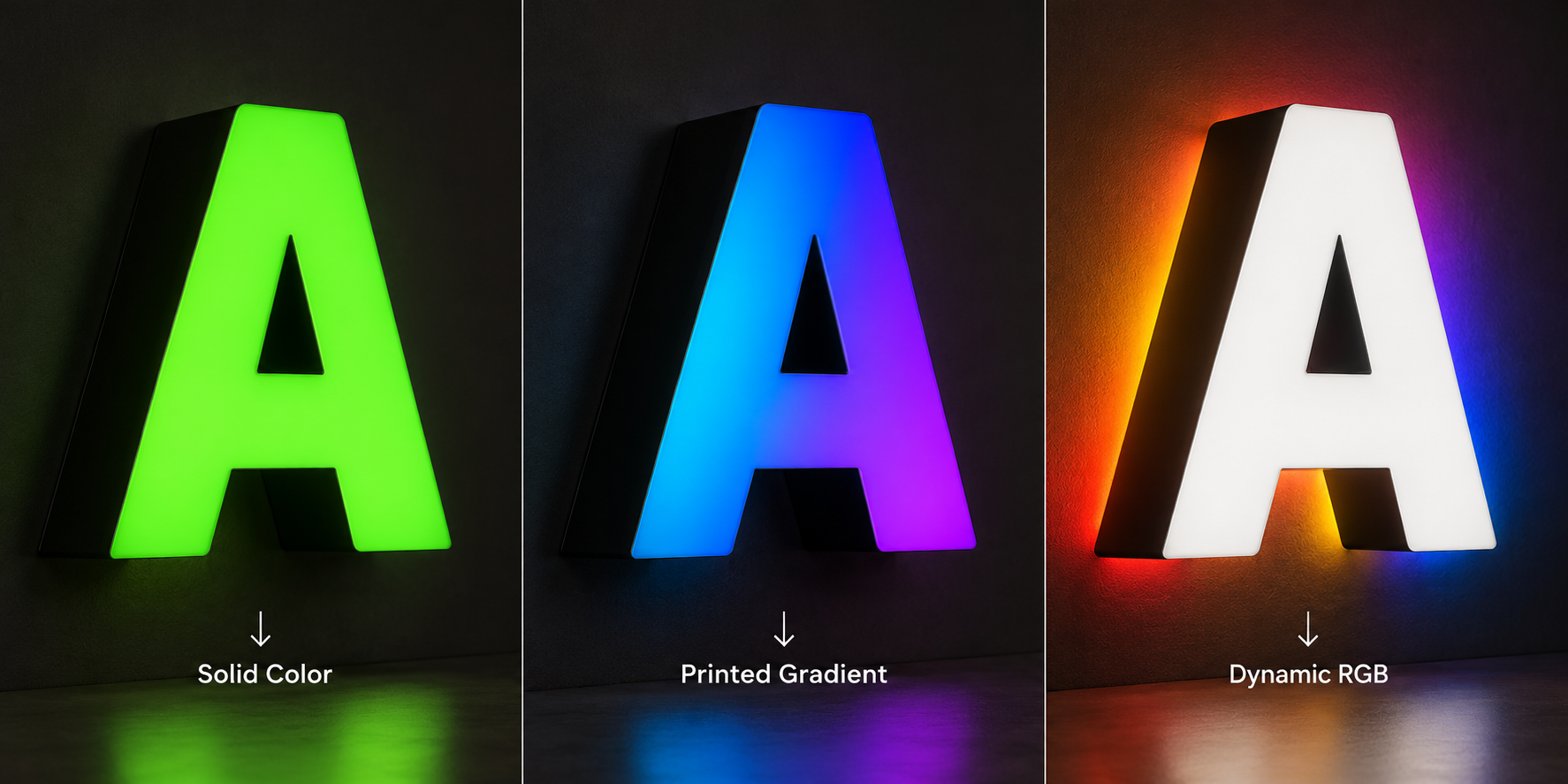
Yes, but first decide which of three color types your logo needs. Each type uses different materials. Each one also needs its own line in the quote.
Solid color, fixed gradient or dynamic light?
The word “gradient” causes confusion in sign requests. One buyer means a printed fade. Another means light that shifts from blue to purple. A factory can’t guess which you want.
| What you want | 何のように見える | How it is usually made | What to write in your request |
| Solid brand color | One flat color per area | Colored acrylic or translucent cut vinyl | Pantone or brand code for each area |
| Fixed gradient | Color fades across the face and never changes | Printed translucent film or UV print on acrylic | Start color, end color, direction, where the fade starts and stops |
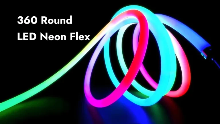
| Dynamic color | The light itself changes color | RGB or RGBW LEDs, a white or opal face, a controller | Static or changing, the effect you want, controller needed |
A solid color stays flat. A fixed gradient is printed, so it stays in one place. Dynamic color changes because the LEDs change, not the face.
SignliteLED offers clear, opal and colored acrylic faces. LED options run from 2700K to 6500K, plus RGB and RGBW. For a printed gradient, confirm the print method before you compare quotes. The right type depends on what your logo needs to do.
A worked example: blue-to-purple gradient with white lettering
Take a common request. It’s an indoor sign built from face-lit dimensional letters. The logo carries a blue-to-purple gradient. The brand name sits beside it in white lettering.
Here’s how to describe it so the quote is accurate:
- The gradient area is a fixed printed fade. It is not RGB light.
- The fade direction runs sideways, downward or along the logo shape. Say which.
- The white lettering needs its own decision. It has three possible builds.
| White lettering option | By day | When lit |
| Lit white | White face, left unprinted on a printed face | Glows white |
| Opaque white | White surface | Stays dark or barely glows |
| Unlit white | Separate white letter or panel | No light at all |
Mark on your file which areas glow. SignliteLED engineers then show each area on the shop drawing. That one note saves a lot of back-and-forth.
So what does this logo usually become? A common starting point is a printed gradient on white or opal acrylic. The white lettering stays unprinted, so it glows white. Cool white LEDs keep the blue and purple clean. Your supplier confirms the final build on the drawing.
How Are Colors and Gradients Created on Face-Lit Signs?
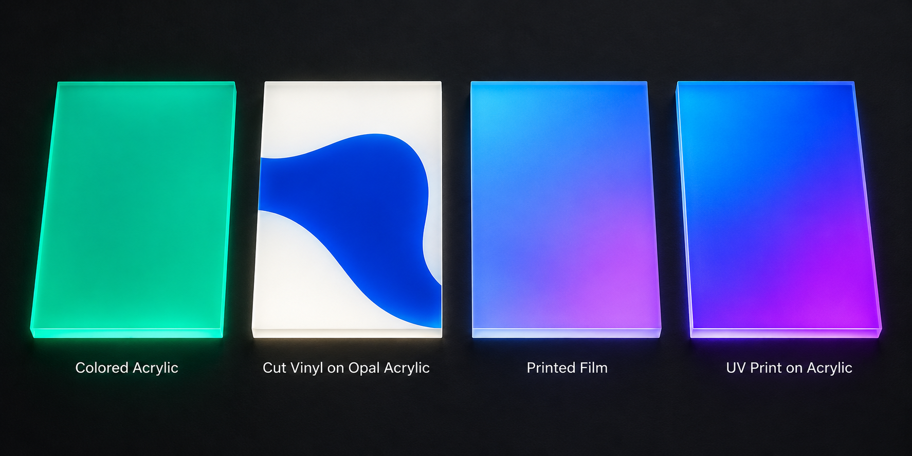
Face color comes from the acrylic, a translucent film, or printed ink. Only printed methods can make a smooth gradient. Cut vinyl and colored acrylic give solid colors only.
Face coloring methods compared
| 方法 | Solid color | Smooth gradient | Watch out for | Best fit |
| Colored translucent acrylic | はい | いいえ | Limited stock colors; exact brand match is hard | One-color logos |
| Translucent cut vinyl on white or opal acrylic | はい | いいえ | Seams on large faces; alignment on small parts | Multicolor logos with flat color areas |
| Printed translucent film | はい | はい | Ink density must suit backlighting; print needs protection | Gradients and detailed artwork |
| Direct UV print on acrylic | はい | はい | Print side, white ink layer, ink density | One-piece gradient faces |
| Day/night film | Special effect | いいえ | Looks dark by day, glows lighter at night | Dark brand colors |
Cut vinyl gives you a wide palette. 3M lists 78 colors in its Scotchcal 3630 translucent series. Its LED-focused 3730 series lists 25, with custom colors by request. But vinyl is cut, not printed. So it can’t fade one color into another.
SignliteLED shows the recommended face build on your shop drawing. Some factories also use layered acrylic for sharply separated colors. Others use translucent paint for a custom solid shade. Ask which methods your supplier actually runs. For dark brand colors, day/night film is a separate option.
What changes the result on a printed face
A printed gradient lives or dies by its layers. Four details decide how it looks when lit.
Print side. First-surface print sits on the outside of the face. Second-surface print sits behind clear acrylic. It must be printed as a mirror image. In return, the acrylic shields the ink from touch and cleaning.
White layer. A white ink layer behind the color gives it body by day. Mimaki describes a color, white, color stack for balanced day and night color. But white also blocks some light. More white means a dimmer face.
Ink density. Backlighting thins out color. 3M’s backlit signage guide warns about thin prints. One first-surface ink layer on flexible film “generally appears pale” when lit. Very bright or very dark images need two ink or film layers. 3M also warns against exceeding the ink maker’s total coverage limit.
Diffuser. A white diffuser hides the LED dots behind the face. 3M says it may dim the image slightly. You get a more even face in return. Too little diffusion can make colors look washed out.
Effort and replacement
Colored acrylic and cut vinyl are the simplest builds. A printed face adds a print, proof and test step. That usually means more setup and a longer approval loop.
Plan for replacement too. Any printed face is replaced as a whole face or film. Keep the approved print file, ink settings and LED spec together. Without them, a new face won’t match the old one.
Where RGB and RGBW fit
RGB and RGBW change the light, not the face. A printed gradient stays fixed whatever the LEDs do.
SignliteLED offers RGB and RGBW LED options for this. Color-changing light works best behind a plain white or opal face. Put a printed color over changing light, and the face filters it. The mix can surprise you. Test any printed face over RGB before you promise the effect.
White is the other catch. RGB makes white by mixing red, green and blue chips. That white often looks tinted. RGBW adds a true white channel, so white lettering stays clean. For programmed effects, compare RGB LED modules and their control options.
Why Do Logo Colors Look Different When the Sign Is Lit?
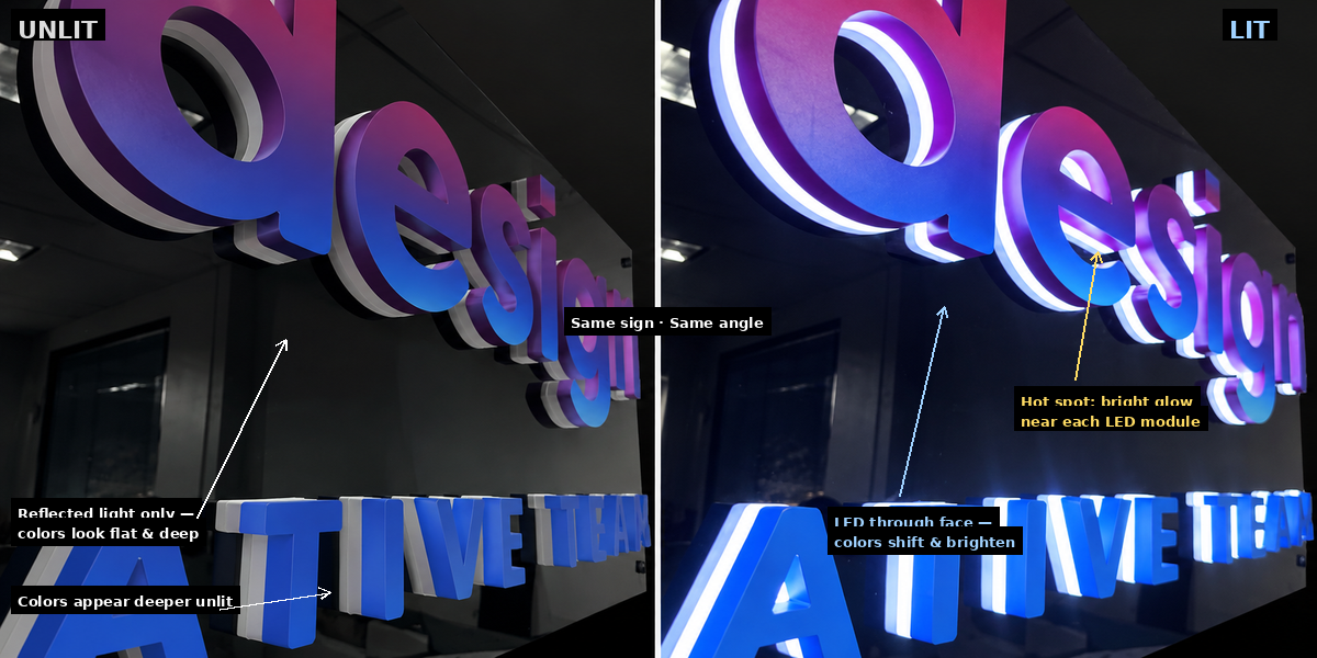
Your screen makes its own light. A lit sign shows LED light passing through the face. The same color will look different on screen, unlit and lit. Plan for all three views.
Screen, unlit face and lit sign are three different views
| What you’re looking at | Where the light comes from | What can change | What you do |
| Screen file | The screen emits RGB light | Looks brighter and more saturated than any face | Never approve color from a screen |
| Unlit face | Room light reflects off the face | Colors look deeper or flatter; pale areas may look gray | Compare it to a physical color chip |
| Lit face | LEDs shine through the face | Colors may look lighter, darker or tinted; bright spots can show | Approve a lit sample |
Pantone books add one more trap. 3M bases its translucent film color references on reflected light, not transmitted light. It also calls many of its Pantone matches “simulated.” So a Pantone code sets a target. It doesn’t guarantee the lit result.
Why blue-to-purple designs need extra care
Blues and purples depend on the blue part of the LED light. A warm white LED has less of it. So warm white can dull blue and push purple toward gray.
3M notes that 3200K to 4200K LEDs make a sign face look yellower. For large colored areas, 3M suggests 6500K LEDs. A blue-to-purple gradient usually reads cleaner under cool white. SignliteLED letters can use LEDs from 2700K to 6500K. Still, test your exact face and LED together. The spectrum matters more than the Kelvin number on a datasheet.
Brightness, dimming and indoor viewing
Brightness changes color too. A very bright face can wash out the pale end of a gradient. At low brightness, dark purple can look heavy or almost black.
An indoor sign is usually seen from a few meters away. Close up, small flaws stand out. Gradient banding is easier to spot. So are hot spots, the bright patches over each LED module. On a gradient, a hot spot can look like a sudden color jump.
Depth plays a part. 3M suggests lower-output LEDs can work 2 to 4 inches behind the face. Deeper boxes need higher-output LEDs or a false back. Ask how deep your letters are, and how the factory evens out the light.
Room light matters for the unlit face. A logo under warm downlights looks different from one under cool office panels. Check the sample in light like your site.
What Should You Check in a Multicolor Logo Design?
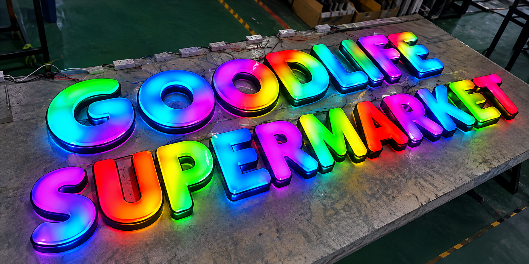
Check four things before you send the file. Look at gradient transitions, white areas, thin strokes and small details. Each one behaves differently once light passes through it. A quick check now saves a remade face later.
| チェック | Why it matters when lit | What you do |
| Gradient start and end | The fade may land on the wrong part of a letter | Mark the start color, end color and direction |
| Short fades | A short fade can show visible steps under LEDs | Check the fade at real sign size |
| Color edges inside letters | One side of an edge can glow brighter than the other | Mark exact color boundaries on the vector file |
| Gradient across separate letters | Each letter is a separate face, so the fade can break between letters | Ask for every face printed from one master layout |
| White lettering | White may glow, stay opaque or stay unlit | Label which white you want |
| Thin strokes | Thin parts may light unevenly or look dim | Ask the factory to confirm the minimum stroke width |
| Small text and fine detail | Detail blurs when lit or can’t be cut cleanly | View the file at final size, not zoomed in |
| File type | Raster images blur when enlarged | Send vector artwork |
Gradient transitions. A long fade has room to blend. Squeeze it into one small letter, and steps can appear. Backlight makes small tone changes easier to see. Look at the fade at the sign’s real size before you approve it.
Gradient across letters. Dimensional letters are separate pieces. A fade that runs across a word must line up from letter to letter. So each face should be printed from one master layout of the whole logo. Ask for a proof that shows all letters side by side.
White areas. White next to deep purple can pick up a gray cast. Light can also bleed across the edge. Decide whether each white area glows, stays opaque or stays dark. Then label it on the file.
Thin strokes. A thin stroke has little room for light. It may look dimmer than the thick parts of the logo. There’s no single safe width for every build. SignliteLED engineers review every logo before the drawing stage. Ask them to confirm the minimum for your letter depth and face.
Small details. Fine serifs, small taglines and tiny icons often blur when lit. Some can’t be cut cleanly at all. Print the logo at real size and stand back. If you can’t read it, neither can your customer.
File type. SignliteLED accepts artwork in AI, PDF, EPS or CDR format. Brand guidelines and reference images help too. Vector files let engineers scale and cut without blur.
How to Approve Colors Before Production
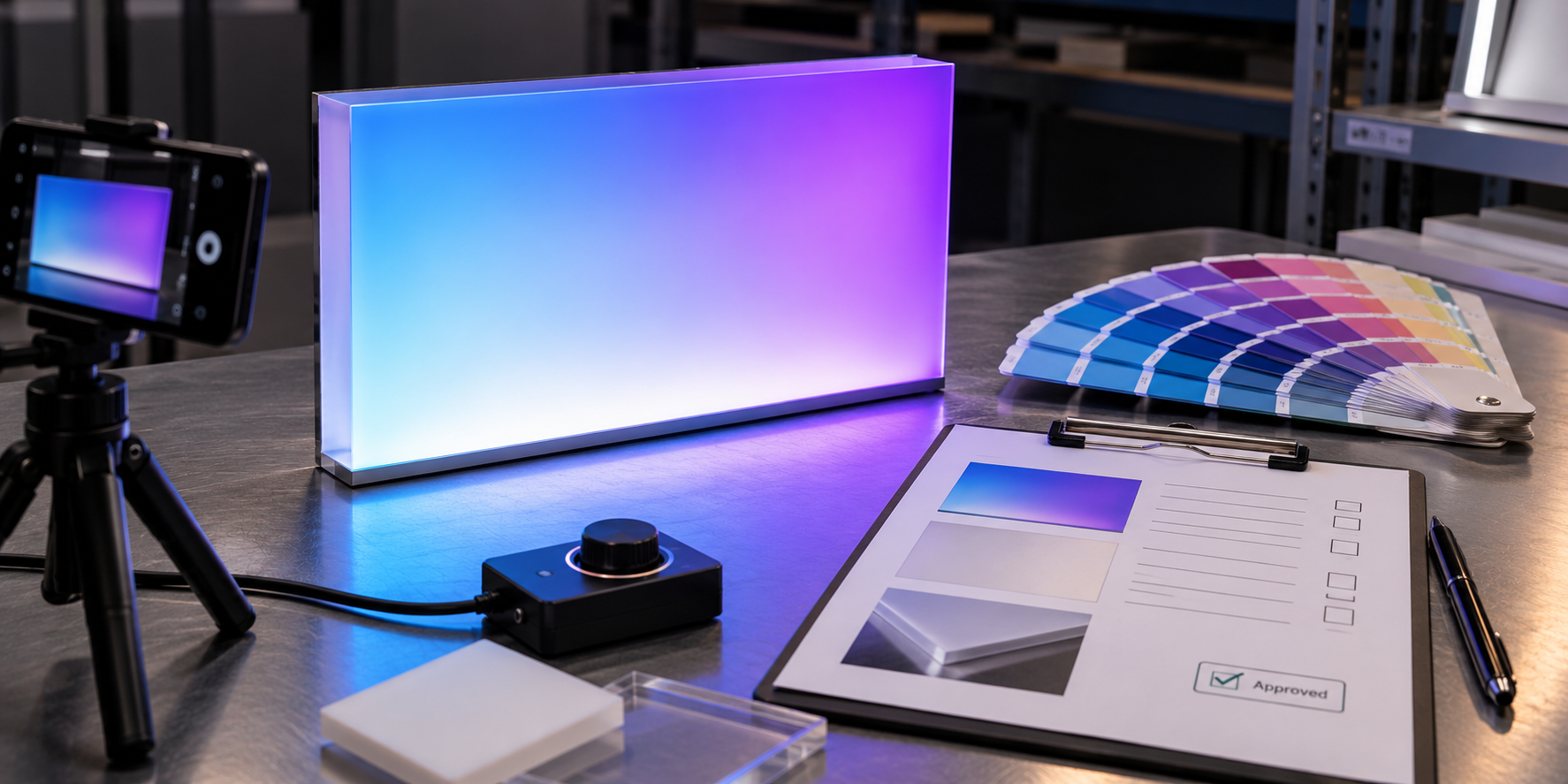
Approve color from a lit sample built with the production face and LEDs. 3M gives the same advice for backlit graphics. It recommends a prototype, approved in both reflected and transmitted light.
What the sample should match
A sample only proves something if it matches production. Ask SignliteLED, or any supplier, to build it with:
- the same face material and thickness
- the same color method: print, vinyl or colored acrylic
- the same LED model and color temperature
- the same letter depth
- the same white layer or diffuser
- the brightness setting you plan to use
Change any one of these, and the color can shift. Ask whether the sample adds cost or time. A printed gradient may need a proof, print setup and lighting test first.
How to compare it
- View the sample unlit in normal room light.
- View it lit in a dim room, from your real viewing distance.
- Hold a physical Pantone chip or approved print beside it. Don’t compare against a screen.
- Check the gradient from end to end for bands or jumps.
- Check white areas for a gray cast or color bleed.
- Look for bright spots over the LEDs.
- Photograph it lit and unlit with fixed camera settings.
Fixed camera settings matter. Auto mode adjusts exposure and white balance for each shot. Then your photos can’t be compared later.
What to record
| 記録 | Example entry |
| Color target | Pantone or brand code for each area |
| Artwork version | File name and revision date |
| Face build | Material, thickness, print side, white layer |
| LED build | Model, color temperature, RGB or RGBW, spacing |
| 明るさ | Dimmer or controller setting |
| Viewing condition | Room light, distance, lit or unlit |
| 結果 | Approved, or what to adjust |
| Approval | Name, date, photo file names |
If something needs to change, say what. “Darker print on the purple end” helps. “Doesn’t look right” doesn’t. The record also settles who approves the lit color if questions come up later.
Matching more signs later
Rollouts and replacements are where colors drift. Keep one approved record for every location. Keep the face build and LED spec together. Changing either one shifts the color. Never approve a replacement face from a screen alone.
What Should You Send for a Custom Sign Quotation?
Send vector artwork, sign size, color targets, lighting effect, quantity and delivery location. These details decide the face method, LEDs and price. Missing one means a second round of questions.
| Send this | なぜ重要なのか |
| Vector logo in AI, PDF, EPS or CDR | Engineers can scale and cut it accurately |
| Final sign size | Fades and thin strokes depend on real size |
| Indoor or outdoor | Materials and brightness change |
| Face-lit, halo-lit or other style | The letter build changes |
| Solid colors or gradient notes | The factory can choose the face method |
| Pantone or brand codes | They set the color target |
| Return and trim cap colors, as Pantone or RAL codes | The sides and edges need their own color |
| White lettering notes | The factory knows whether white should glow |
| Static light or RGB/RGBW effect | LEDs and a controller go into the quote |
| Quantity and delivery place | Packing and freight depend on them |
| 締め切り | The factory can flag timing risks early |
With a complete request, you get a custom sign quotation that’s easy to compare. SignliteLED then sends a shop drawing that shows the face build. Production starts only after you approve it.
Comparing several factories? Our guide to choosing a channel letter manufacturer shows how to line up quotes.
結論
Name the color type, choose the face method, then approve the lit color. Those three steps prevent most brand color problems.
First, decide whether you need a solid color, a printed gradient or changing light. Next, pick a face method that can actually produce it. Check the design at real size. Then approve a lit sample, and record what you approved.
Ready to price your logo with SignliteLED? Send your logo in AI, PDF, EPS or CDR format. Mark the gradient areas and white lettering on the file. We’ll review it and recommend a face build for your custom logo sign.
よくある質問
作者: Richard Liang 氏、製品およびプロセス マネージャー シグライトLED
テクニカルレビュー: SignLiteLed の R&D リーダー、ジェイソン チェン
メールアドレス: info@signliteled.com
関連記事