LED color temperature is one of the most critical variables in lighting design, directly influencing how a space looks, feels, and performs. Common searches such as 3000K vs 4000K, 4000K vs 5000K, and which color temperature is best reflect a real challenge: selecting the correct Kelvin value for a specific application.
In practice, the wrong choice can lead to visual discomfort, poor contrast, or an environment that does not match its intended purpose. In commercial settings, this can affect productivity, product visibility, and even customer perception.
This guide provides a structured comparison of LED color temperatures from 2700K to 6500K, with real performance ranges, practical use cases, and decision-making guidance for both lighting design and commercial applications. This LED color temperature guide includes comparison charts, practical use cases, and step-by-step selection methods to help you choose the best lighting for any environment.
Chìa khóa rút ra
- Color temperature defines the visual tone of light and impacts both comfort and functionality
- 2700K–3000K creates warm environments suitable for residential and hospitality lighting
- 4000K provides balanced illumination for office and retail environments
- 5000K–6500K is typically used where visibility and clarity are prioritized
- Lighting design focuses on user experience, while commercial lighting prioritizes performance and consistency
- Choosing the correct Kelvin value improves both visual comfort and operational efficiency
- Comparison-based selection is more reliable than choosing based on preference alone
Quick Color Temperature Selection Guide
Choosing the right color temperature depends on the type of space and how it is used. The table below provides a quick reference used by lighting designers and engineers for common applications.
| khoảng trống | Recommended Kelvin | Technical Reason |
| phòng ngủ | 2700K | Promotes relaxation and reduces eye strain |
| Restaurant | 2700K-3000K | Enhances ambiance and warmth |
| chức phận | 4000K | Improves focus and task clarity |
| sự bán lẻ | 4000K – 5000K | Balances product visibility and brightness |
| Warehouse | 5000K-6500K | Maximizes visibility and operational safety |
Nhiệt độ màu LED là gì?

LED color temperature refers to the color appearance of light emitted by a source, measured in Kelvin (K). Lower Kelvin values produce warm, yellow-toned light, while higher values create cooler, bluish-white light.
This progression from warm to cool directly affects how objects appear and how people perceive a space. It also influences contrast, clarity, and overall usability.
The table below summarizes the main categories:
| mẫu | Kelvin Range | hiệu ứng hình ảnh | Sử dụng điển hình |
| Trắng ấm | 2700K-3000K | Soft, warm tone with reduced contrast | Residential, hospitality |
| Neutral White | 3500K–4500K | Balanced white light with clear visibility | Offices, retail |
| Màu trắng mát mẻ | 5000K-6500K | Crisp light with increased contrast | Outdoor, industrial |
LED Color Temperature Chart (2700K–6500K)
The table below provides a simplified overview of common LED color temperatures, their visual appearance, and best use cases. This format is widely used in lighting design for quick reference and decision-making.
| thanh khát | màu nhạt | Visual Tone | Sử dụng tốt nhất |
| 2700K | Trắng ấm | Soft, yellowish | Bedrooms, residential spaces |
| 3000K | Trắng ấm | Slightly neutral warm | Restaurants, hospitality |
| 4000K | Neutral White | Balanced white | Offices, retail stores |
| 5000K | Màu trắng mát mẻ | Bright, crisp | Commercial, task lighting |
| 6500K | ánh sáng ban ngày | Bluish white | Industrial, outdoor |
Why Color Temperature Matters in Lighting Design
Color temperature plays a functional role beyond aesthetics.
- Visual comfort: Warmer light reduces eye strain in low-activity environments such as living rooms and hotels
- Task performance: Neutral light (around 4000K) improves clarity for reading, working, and detailed tasks
- Color accuracy: Retail and display lighting rely on specific Kelvin ranges to present products correctly
- Spatial perception: Architectural lighting uses color temperature to define depth, highlight structures, and create contrast
Even with high-quality fixtures, incorrect color temperature selection can result in poor lighting outcomes.
LED Color Temperature Comparison Chart (2700K–6500K)

The following table provides realistic performance ranges based on common LED strip and fixture specifications.
| thanh khát | bề ngoài | Typical Output (lm/m) | CRI Range | Các ứng dụng chung | Practical Effect |
| 2700K | Warm amber | 300–600 lm/m | 85–95 | Bedrooms, hotels | Relaxed atmosphere, softer shadows |
| 3000K | Trắng ấm | 400–800 lm/m | 80–95 | Living rooms, restaurants | Comfortable visibility with slight warmth |
| 4000K | Màu trắng trung tính | 600–1200 lm/m | 80–90 | Offices, retail | Clear visibility with balanced contrast |
| 5000K | Màu trắng mát mẻ | 800–1500 lm/m | 70–85 | Warehouses, task areas | Increased contrast for detailed work |
| 6000K | ánh sáng ban ngày | 1000–1800 lm/m | 70–80 | Outdoor, security | Maximum visibility and sharp edges |
These color temperature ranges are widely used in both architectural lighting design and
commercial lighting systems, helping standardize lighting decisions across different applications.
How Color Temperature Affects Lighting Design and
Commercial Performance

Different Kelvin ranges are selected based on whether the priority is visual comfort or operational performance.
Warm lighting (2700K–3000K) is used where people spend extended time, as it reduces visual fatigue and creates a relaxed environment. Neutral lighting (4000K) is used where clarity and accuracy are required, such as offices and retail spaces. Cooler lighting (5000K–6000K) is applied in environments where visibility, contrast, and safety are critical.
In commercial applications, higher color temperatures are often selected to improve efficiency and consistency across large areas, while design-focused environments prioritize lower Kelvin values for aesthetic control.
This distinction is essential when planning lighting systems for projects that require both visual comfort and commercial performance.
Color Temperature for Lighting Design vs Commercial Applications
Lighting design and commercial lighting use color temperature differently based on priorities such as comfort, visibility, and operational efficiency.
| người mua bán | Lighting Design (Architectural/Residential) | Commercial Applications |
| Typical Kelvin Range | 2700K-4000K | 4000K–6500K |
| Primary Goal | Visual comfort and ambiance | Visibility and task performance |
| CRI Requirement | 90+ preferred | 80+ standard |
| Brightness Range | 300–800 lm/m | 600–1800 lm/m |
| Application Focus | Homes, hotels, facades | Offices, retail, industrial |
Understanding this difference allows designers and engineers to align lighting specifications with both user experience and operational requirements.
Detailed Color Temperature Comparisons

2700K vs 3000K
The difference between 2700K and 3000K is primarily in tone and perceived brightness.
| thông số | 2700K | 3000K |
| Light Tone | Warm amber | Trắng ấm |
| Phạm vi đầu ra | 300–600 lm/m | 400–800 lm/m |
| chuyện dữ dội | 90–95 | 80–95 |
| Ứng dụng | Bedrooms, luxury hospitality | Living spaces, dining areas |
| hiệu ứng hình ảnh | Softer, more intimate | Slightly clearer and more versatile |
2700K is typically selected for relaxation-focused spaces, while 3000K is used where a balance between comfort and visibility is required.
For a deeper technical comparison, refer to a detailed 2700K vs 3000K LED lighting guide covering application-specific differences.
3000K vs 4000K
This comparison reflects a transition from ambient lighting to functional lighting.
| thông số | 3000K | 4000K |
| Light Tone | Trắng ấm | Màu trắng trung tính |
| Phạm vi đầu ra | 400–800 lm/m | 600–1200 lm/m |
| Ứng dụng | lòng hiếu khách, khu dân cư | Offices, retail |
| Sự thoải mái trực quan | More relaxed | More focused |
| Task Suitability | ức chế | địa vị cao |
3000K supports comfort-based environments, while 4000K is widely used in commercial lighting applications where clarity is essential.
Also Read This Comparison: 3000k vs 4000k vs 5000k vs 6000k: Sự khác biệt là gì?
4000K vs 5000K
This comparison highlights the difference between balanced lighting and task-oriented lighting.
| thông số | 4000K | 5000K |
| Light Tone | Neutral | Cool |
| Phạm vi đầu ra | 600–1200 lm/m | 800–1500 lm/m |
| Ứng dụng | Offices, retail | Industrial, workshops |
| Visual Clarity | làm cho quân bình | Enhanced detail visibility |
| sự dùng | General workspaces | Task-intensive environments |
4000K is suitable for general environments, while 5000K is selected where higher contrast is required. This comparison is part of a broader color temperature analysis that also includes higher Kelvin ranges such as 5000K and 6000K.
5000K vs 6000K
Both are used in high-visibility environments, but 6000K produces a sharper, daylight-like effect.
| thông số | 5000K | 6000K |
| Light Tone | Màu trắng mát mẻ | ánh sáng ban ngày |
| Phạm vi đầu ra | 800–1500 lm/m | 1000–1800 lm/m |
| Ứng dụng | Commercial, industrial | Outdoor, security |
| sự trông thấy được | kiên cố | Maximum |
| Environmental Suitability | Indoor large spaces | Tiếp xúc ngoài trời |
6000K is typically used where maximum visibility is required, especially in outdoor applications.
A detailed 5000K vs 6000K comparison further explains how these color temperatures perform in high-visibility environments.
Watch detailed explanation of 5000K vs 6000K lighting differences:

Where to Use Each Color Temperature
Selecting the correct Kelvin range depends on the function of the space and user expectations.
| Ứng dụng | Recommended Kelvin | Technical Reason |
| phòng khách | 2700K-3000K | Reduces eye strain, supports relaxation |
| chức phận | 4000K | Improves clarity and task efficiency |
| sự bán lẻ | 3000K-4000K | Balances warmth with product visibility |
| ngoài trời | 5000K–6000K | Enhances contrast and safety |
Selecting the correct Kelvin range based on application ensures optimal lighting performance in both residential and commercial environments.
Indoor vs Outdoor Lighting Comparison

Indoor and outdoor lighting differ in both environmental conditions and performance requirements.
| người mua bán | Chiếu sáng trong nhà | Ánh sáng ngoài trời |
| Kelvin Range | 2700K-4000K | 5000K-6500K |
| Phạm vi đầu ra | 300–1200 lm/m | 800–1800 lm/m |
| Comfort Requirement | địa vị cao | Secondary |
| Environmental Protection | IP20–IP44 | IP65+ |
| Use Focus | Sự thoải mái trực quan | Visibility and safety |
How to Choose the Right Color Temperature
Choosing the correct color temperature requires a combination of functional, visual, and environmental evaluation rather than a single preference-based decision.
- Define lighting function (ambient vs task)
Ambient lighting typically uses 2700K–3000K to create comfort, while task lighting requires 4000K–5000K for clarity and precision. - Analyze user behavior and duration
Spaces where users spend extended time should use warmer tones, while task-focused environments benefit from neutral or cool lighting. - Evaluate visual performance requirements
Retail and display lighting often require 3000K–4000K with higher CRI for accurate color representation. - Consider space scale and layout
Large commercial areas require consistent and higher-output lighting, while smaller spaces can use warmer tones. - Ensure system consistency
Avoid mixing multiple color temperatures without zoning to maintain visual balance. - Align with project type
Residential lighting focuses on comfort, while commercial lighting prioritizes performance and efficiency.
In most practical scenarios, 2700K–3000K is suitable for comfort-focused environments, while 4000K–5000K is preferred for performance-driven commercial lighting applications.
Need Help Choosing the Right Color Temperature?
If you’re unsure which color temperature is best for your project, professional guidance can help avoid costly mistakes.
Our lighting engineers can recommend the optimal Kelvin range, brightness level, and LED configuration based on your specific application.
How Lighting Designers Choose Color Temperature
Professional lighting designers do not rely on guesswork. Instead, they follow a structured decision process to ensure both performance and visual comfort.
Step 1: Determine the application
Identify whether the space is residential, commercial, or industrial.
Step 2: Evaluate brightness requirements
Assess lumen output needs based on task complexity and space size.
Step 3: Consider visual comfort
Ensure the selected Kelvin range aligns with user comfort and duration of exposure.
Step 4: Match LED specifications
Select appropriate LED chips and CRI levels based on color accuracy requirements.
This structured approach ensures consistent and optimized lighting performance across different environments.
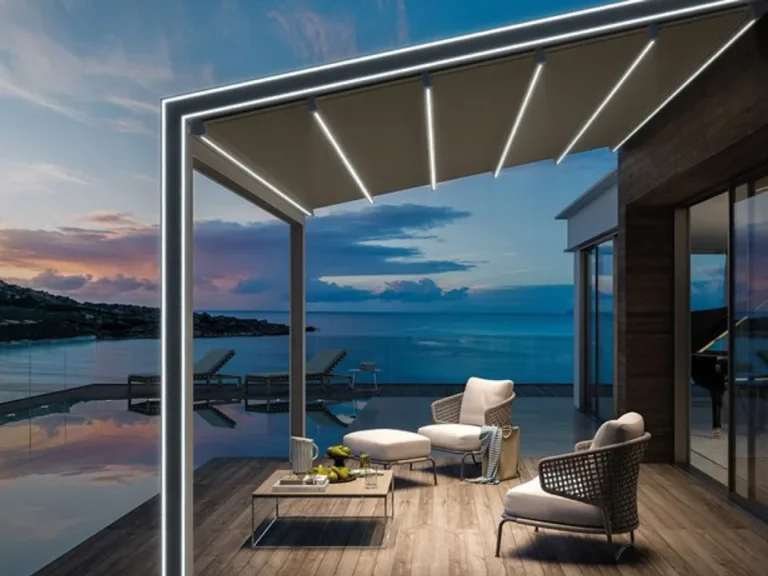
Architectural & Commercial Applications
Color temperature is a critical parameter in architectural lighting design, influencing both aesthetics and performance.
- Facade lighting: Typically uses 4000K–6000K to enhance structural visibility
- Office lighting: Standardized around 4000K for productivity and comfort
- Retail lighting: Uses 3000K–4000K to improve product appearance
Commercial lighting systems prioritize consistency and efficiency, while architectural lighting focuses on visual experience and design integration.
Related Color Temperature Comparisons
To better understand how different Kelvin values perform in real-world lighting applications, explore the following detailed comparison guides:
- 2700K vs 3000K LED Lighting Comparison (Residential & Hospitality)
- 3000K vs 4000K vs 5000K vs 6000K Full Comparison Guide
- 5000K vs 6000K LED Lighting Comparison (Industrial & Outdoor)
These guides form a structured LED color temperature hub, improving navigation, SEO rankings, and AI discoverability.
Tóm tắt nhanh
To simplify decision-making, the key color temperature ranges can be summarized as follows:
- 2700K–3000K → Best for residential and hospitality lighting where comfort is the priority
- 4000K → Best for office and retail environments requiring balanced clarity
- 5000K–6500K → Best for industrial and outdoor applications where visibility is critical
This quick summary is commonly used by lighting designers and engineers for fast decision-making across different applications.
How to Choose LED Color Temperature (Step-by-Step Guide)
Selecting the correct color temperature can be simplified using a practical decision framework:
- Residential spaces → 2700K–3000K
- Commercial environments → 3500K–4000K
- Industrial applications → 5000K–6500K
This approach helps quickly align lighting choices with functional requirements and user expectations.
CTA
If you’re looking for high-performance LED strip lighting with precise color temperature control:
- Get expert recommendations based on your project requirements
- Choose from multiple Kelvin options with consistent output
- Customize OEM / ODM lighting solutions for commercial and architectural use
Liên hệ SignliteLED today to discuss your project and receive a tailored lighting solution.
Phần kết luận
LED color temperature is a key factor that determines how lighting performs in both design and commercial environments. Each Kelvin range serves a specific purpose, and selecting the correct one ensures better comfort, visibility, and efficiency.
Understanding the differences between 2700K, 3000K, 4000K, 5000K, and 6000K allows designers and decision-makers to create lighting systems that are both functional and visually effective.
These color temperature ranges form the foundation of modern architectural lighting design and commercial lighting systems.
Câu hỏi thường gặp
Bài viết liên quan